5 TIPS FOR CREATIVE AN EFFECTIVE LOGO DESIGN FOR YOUR BRAND
For a lot of companies, a strong logo is what customers associate with your brand. Successful logo designs act as a recognizable symbol for your brand, and helps your valued customers identify your products and services. When it comes to branding, the right logo design is a quintessential component.
A logo is an essential part of a strong branding strategy, however designing one that is both representative of your brand and visually appealing requires a tactical approach. You want a logo that is capable of embodying your entire brand and highlights your company values without being overly comprehensive that it loses its visual appeal.
From existing logos that need a redesign, to logos that are merely in the conceptual phase for start-up brands, when it comes time to develop a branding strategy for your logo design, there are several guidelines to keep in mind.
1. FOCUS ON SIMPLICITY
Keeping your logo simple is essential. If you have too much for the user’s eye to focus on with the logo, it’s harder for both potential and existing customers to recognize it. Too many flashy elements in a design can be distracting and take away from the core objective of the logo itself—to serve as a representation of your brand.
Whether you’re creating a new logo for a new company, or redesigning a logo that is outdated, at its core, a logo is intended to symbolize your brand, so it’s best to keep them visually appealing while still using a clean design. A good rule of thumb is to make sure that all logos appear as they should with a duo-tone, which is black on a white background.
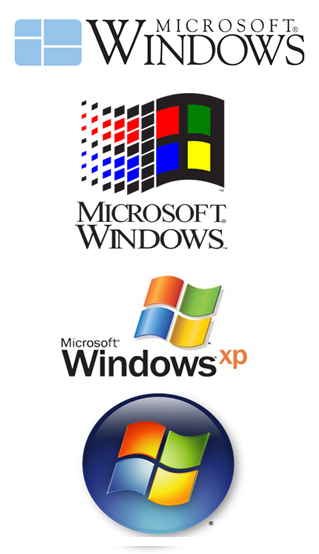
Consider Windows as an example. Although the brand has undergone many logo redesigns since their inception, their current design is a modernized shift from the logos that preceded it. The Windows logo today (pictured below) is arguably their simplest and cleanest design yet.

With a brand that was founded on the forefront of the digital age, their logo truly embodies that. Its simplicity and digitalized look and feel is a perfect representation of the company today. If you take a look at the evolution of some of their older logos below, you can certainly still notice some original branding elements in their current logo.
Aside from quick brand recognition and a design that is easier on the eyes, keeping logo designs as simple as possible is also crucial when it comes to the use of your logo on other materials, which brings us to the next point.
2. WHERE WILL THE LOGO BE USED?
When you’re in the process of a new logo design or are redesigning an existing logo, you should always think about where the logo will be used and how it will appear. From business cards, to poster boards, to onsite elements, it’s important to think about how your logo will appear both online and offline.
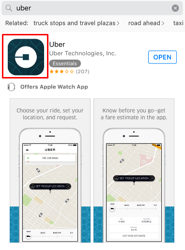
Uber recently redesigned their logo to more accurately depict the “story” of their brand. Since most of their customers use the app from their smartphones, it’s likely that the brand had to primarily focus on how the logo would appear on an app icon and on a small screen.
Failing to consider the future use of your logo can result in a lot of difficulties down the road. If your logo could eventually be placed on the side of delivery trucks, on large billboards, or on small business cards, it’s key that you consider how the design will appear on all of these platforms and pieces of collateral. Something that looks good on a business card might not render well when placed on a large billboard, so always think about how your logo will render on a variety of platforms before selecting a final design.
3. KEEP UP WITH DESIGN CHANGES OVER TIME
Unfortunately, even the best logos don’t last forever. In order to stay up-to-date and timely, it’s important to consider small tweaks to make your logo current. That being said, if your logo has been successful in the past, it’s not always the best choice to do a significantly drastic shift from the design you have already been using. Sometimes a simple change of type face or using a cleaner icon can do a lot to make a logo more fitting with the times.
If you’re seeking a new logo for your company or are going through a time where you’re rebranding your organization, focus on trying to find a balance. If you’re working with the right team of designers and brand marketers you can find a happy medium between the existing logo vs. an updated design that evokes a new look and feel.
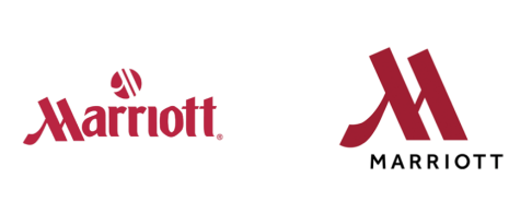
Recently, Marriott hotels shifted their well-known logo design to something a bit more up-to-date. This logo redesign is a great example of finding a balance between a new and old look. They kept the style of their iconic “M” but made the rest of the text black as opposed to the traditional red. The clean design is not a drastic shift from their old logo, but still has a modernized feel to it.
4. CONSIDER A ‘TIMELESS’ DESIGN
As discussed above, sometimes after a period of time, your logo design is overdue for an update. That being said, when you change your logo, you don’t want it to be due to a massive need for a change because of a completely outdated look. A general guideline to stick to with redesigning your logo is to avoid anything that is trendy because it won’t last forever. Too often brands choose a design that has a trendy look and feel, and this can be a costly mistake. If you select a design that is timely and not something with longevity, it’s not likely to stay current, it might not be fitting with your brand values, and there is also a good chance that a lot of other brands have a similar design.
Even if you’re not going through a redesign and are starting a new company that needs its first logo, it’s best to go with a timeless and clean design. This isn’t to say that you don’t need a modern look and feel for your logo, however you shouldn’t be including design elements that are simply the trend of the year.
5. FOLLOW THE RIGHT PROCESS
Lastly, when you’re beginning the logo design process, it’s essential that you take the necessary steps to ensure that you’re crafting a design that has the potential to effectively drive brand recognition for your company.
At ImagiWorks, our logo design process begins with a kickoff meeting to better understand the objective of your branding project. Next, we conduct a “logo exploratory” where we pull together a variety of different logos for brands across all industries to share with the company we are working with. The goal of this phase is to garner some reactions and develop a deeper understanding of what designs spark the most interest and capture the most attention.
From this point, we begin researching and conceptualizing the logo design based on our findings thus far. We create “word clouds” so that we can understand what the logo should embody, and conduct research to identify what these key phrases and words look like for the average user.
*Article originally written by huffingtonpost.com*