CADBURY DAIRY MILK CHOCOLATE GETS NEW LOOK
You might have noticed something a little different on your last visit to the confectionary aisle at your local supermarket. That’s because Cadbury has undergone a quirky new re-brand that even Willy Wonka himself would have been proud of!
The major question was however: How do you take an iconic brand and create a design for the future? That was the welcoming dilemma faced by London design agency Pearlfisher as Cadbury sought to re-establish their brand positioning.
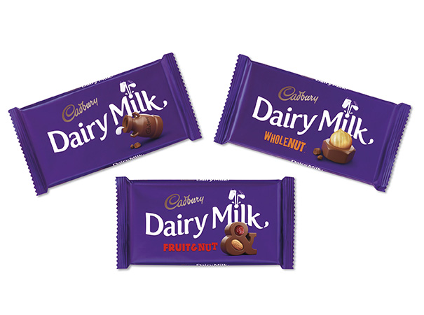
The minds at Pearlfisher were inspired by the ‘say what you see’ approach, replacing original product shots on the packaging with “playful, imaginative and joyful expressions” of each unique flavour, giving Cadbury’s Dairy Milk range a new characterisation.
Cadbury’s Dairy Milk range will also feature QR codes, allowing customers to download surprise “joyful content” that’s been designed by the Cadbury team to help put a smile on their faces.
The difference?
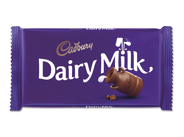
Here’s the latest packaging redesign for Cadbury Dairly Milk:
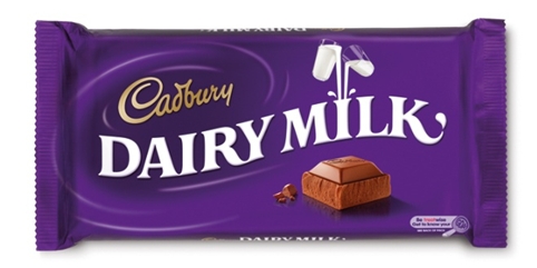
And here’s the previous Cadbury Dairy Milk packaging design:
Brighter colours, product shots replaced with fun illustrative style elements, new typography, QR codes and total simplification are the essential components that have made this Cadbury rebranding second to none. So next time you’re in your local supermarket, take notice of the changes and let us know your thoughts!